Tuesday, June 9, 2015

Yosemite Valley

1. What photo have you taken this school year that changed how you viewed photography? What is your decisive photo? Why? 
This photo I took over Memorial Day weekend at Yosemite Valley, has changed how I view photography. I believe that this photo really portrays my breakthrough, and shows how I have improved in my photography skills. I wanted to get a photograph so good that I never have done before, and I did it with patience. After taking several shots of this creek, I took my time to determine which angle was right. I am glad how this picture turned out. There are different levels in this photograph. The creek and small rocks can be seen in the bottom portion. The grassland and spread of trees can be seen in the middle portion of the photograph. And the towering rocks, and the smoky sky can be seen in the top portion of the photograph. 

2, What is the difference between shape and form?
A shape can simply be a line, or any form of a geometric shape. Form is more than a shape, it goes beyond showing length and width. Rather, form expresses depth, which is very important in the field of photography. Form is shape and more. 

3. What is the difference between pattern and repetition? 
Pattern can be  the repeating of an object or a symbol in a photograph. It is the same figure seen repeatedly in the work of art, Similar to form, repetition extends beyond pattern. Repetition uses a pattern to unify the photograph and make the work of art seem alive. 

4. Define movement using one of your photos and an explanation. You may also link to your earlier explanation when we defined principles of design.
The definition of movement is the path the viewers' eyes take as they observe the photograph. Movement can be seen in this photograph On this Mission Peak trail. At first, the viewer's attention is drawn to the base of the trail in this picture. The two shadows on the left are not too far from the base, and hence are the next point of attraction in the photo. The trail then extends beyond the horizon of the hill, before slightly appearing again. Once the trail can no longer be seen, the viewer's attention is brought to the peak, and then finaly to the sky scattered with clouds. 

5. Of the last three projects, what was your best work? Include the link to your best work and explain why you believe this is your best work. How did this project change you? How did you learn to see differently?
Of my last three projects, I believe my Final Project is my best work for various reasons. Because this was the last project I did in my photography class, I wanted to finish it with no regrets. I made sure to use all the knowledge of photography I learned throughout the year in this assignment. I was patient and I took hundreds of shots from various angles and took my time to pick the best ones. I used principles such as, Rule of Thirds, Depth of Field, and Balance. This project changed my because it allowed my to change my perception of photography. I learned to see differently by taking a more patient approach to this assignment. The beautiful scenery of Yosemite National Park supplemented my work and helped make this my best assignment in my opinion. The weather was perfect, the lighting was on point, and the smoke from nearby wildfire gave the sky a warm, amber-like look

Wednesday, June 3, 2015

Yosemite Valley

This past Memorial Day Weekend, I took photos at Yosemite National Park after being inspired from various nature photographers. I used my inspiration to capture these photos and use them for this assignment. I am happy the way these photos turned out. The sky in many of these photos has a smoky look, because the smoke from a nearby wildfire drifted into the Yosemite Valley. 


Friday, May 29, 2015

Student Website Review

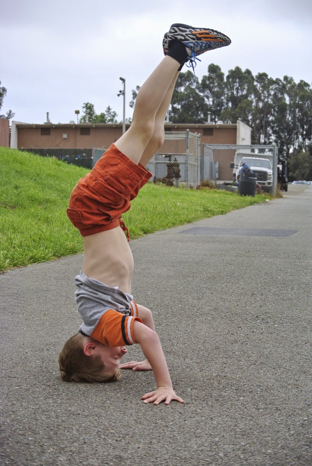
On Ryen's Weebly page, I like the photo of the child doing the handstand, in his More of My Favorite Work Gallery. I think the photo was appropriately captured, using a fast shutter speed to capture the details of the subjects motion. I also like how the subject is off-centered, to draw greater attention.

On Rudrik's Weebly page, I like the second photo on the Commercial Photo shoot Assignment Gallery. In this photo, the picture was taken form a low angle, making it seem as if the subject was jumping higher. The rubber platform below the subject is centered in the photo, and stretched to the back of the photo. This draws the viewer's attention from the subject, to the background.

On Haroon's Weebly page, I really like the lawn chair photo from his Best of My Work Gallery. This photo illustrates shallow depth of field, and allows the viewer to see the lawn chair from a different perspective. The shallow depth of field used in this photo, shows how neatly the fibers are woven, in great detail.

Tuesday, May 19, 2015

Presentation Project: Skies

The objective of this project was to shoot different photos of the sky at different weather conditions. Over the past week there has been clear blue skies, heavy overcast, drifting clouds, and even rain. In this project, we captured these different types of skies. 
Weebly Gallery can be found here:

Edited by: Michael Shen

Edited by: Allen Hsiao

Edited by: Anish Bhanot

Edited by: Anish Bhanot

Edited by: Anish Bhanot


Friday, May 8, 2015

Commercial Shoot Assigment

Inspired By Beats Advertisement: 
Edited By Anish Bhanot

Inspired By iPhone Advertisement:
Edited by: Anish Bhanot

Inspired By iPhone Advertisement:
Edited by: Allen Hsiao

Inspired By iPhone Advertisement:
Edited by: Anish Bhanot

Inspired By iPhone Advertisement:
Edited by: Micheal Shen


Monday, April 20, 2015

Multicultural Week Photo Story

Blue skies, sunny day.
There are hungry students searching stands for good deals.

This club is selling Thai Tea for $3.

Payment this year is in the form of tickets due to corruption in fundraising last year. 

This Thai Tea was delicious, it quenched my thirst of the day.

Thursday, April 16, 2015

A Photo from Multi-Cultural Week


This is my friend Derek Bai carrying Pho to his clubs table. Pho is a traditional Vietnamese dish, and is sold this week to share the Vietnamese culture. 

Wednesday, April 15, 2015

My Experience at Multi-Cultural Week

This week, I have been able to learn about various cultures. I have been able to smell different aromas, taste different foods, and see different sights. I never tried Pho, a Vietnamese food. Milk Tea was also a new experience for me. I never knew what Coca-Cola was until I discovered it hear at Multi-Cultural Week. This week has been a agglomeration of different cultures. A time where we learn about the lifestyles of different people. I would definitely participate in this event again.

Thursday, April 2, 2015

Shutter Speed and Everything After

1. The shutter speed is fast, because the trucks are in motion. In order to get a clear picture of the trucks in motion, the lens should open for a less amount of time. If the shutter speed was slower, the moving trucks would have been blurry.
2. One rule of composition used in this photo is Leading Lines. There are various lines on the roads and the center barrier that draw our attention to the trucks.
3. Form is a big element of art used in this photo. The three dimensional shapes of the trailers emphasize the shapes of the main subjects in the picture.
4. Movement is a bug principle of design used in the photo. The lines on from the road and center barrier draw the attention of the viewer. The viewer's attention then moves from the lines to the trailers.

 f/3.8      1/500     ISO 320

Friday, March 27, 2015

Principles of Design: Unity

Edited

Original

This photo represents unity in the sense that each color and shape in this picture complements one another. For example, the leaves are the main focus of the picture, but the stem completes the shape of the plant. Furthermore, the orange and yellow colors on the left complement and vibrant green of the leaves. 
Edits:
Exposure: 0
Contrast: +23
Highlights: -8
Shadows: -11
Whites: -5
Blacks: -15

Our Photo of the Day

Our group chose this photo as our photo of the day. This photo represents variety with the different elements in the picture. The viewers' attention first goes to the net and the fishes caught. The viewers' attention is also drawn to other aspects of the photo such as the fishermen, the boat, the water, or even the trees in the background.

Thursday, March 26, 2015

Principles of Design: Variety

Edited

Original

This photo emphasizes Rhythm as a principle of design. There are several elements that draw the attention of the viewer. For example, the color full mural on the stage and the backdrop are the main focus of the picture. There are also three main parts of the picture: the green grass, the stage, and the clear blue sky. I cropped the sides of the picture to draw more attention to the backdrop. 

Edits:
Contrast: 0
Highlights: -17
Shadows: +40
Whites: -20
Blacks: +24

Principles of Design: Rhythm


Edited


Original

This photo represents rhythm as the pipes are repeatedly seen. The pipes run straight, and create a sense of organized movement. At a distance, the pipes curve to different paths. I cropped the bottom of the picture, because the overexposed space was creating a distraction. 

Edits:
Contrast: +0
Highlights: +9
Shadows: +7
Whites: -8
Blacks: -6


Tuesday, March 24, 2015

Movie Monday Half Past Autumn Part 3 and 4

1. One is successful when they are satisfied with themselves. When one has achieved a point at which he or she feels accomplished.
2. I have given up many personal things in life in order to be successful.
3. Gordon Parks became successful by taking risks in life. He left jobs many times, to get better jobs. But more importantly, he became successful by accomplishing what he loved. He was committed to social justice.
4. Genevieve Young's father was Kuang-son Young.
5. Parks was advanced $10,000 to write his book. His book was called The Learning Tree.
6. Elijah Muhammad offered Parks half a million dollars to do a story on the Nation of Islam.
7. Parks refused the money, because he thought that Muhammad was trying to influence him.
8. The Learning Tree film was historic because it was the first time an African American directed a Hollywood film.
9. Shaft was the first African American superhero.
10. His weapon was his camera. He used it to send a message to the world.
11. Genevieve Young felt that she and Parks were not spending enough time together.
12. Odyssey Is 12 Years a Slave told the same story as Parks' film.
13. Gordon Parks Jr. was Parks' eldest son. He died in a plane crash.
14. My favorite Gordon Parks photo is the one were the maid was folding a broom. I felt that it sent a powerful message.
15. I will remember that he was an iconic photographer who fought for a purpose. He fought for his passion, social justice.

Friday, March 20, 2015

Principles of Design: Proportion

Edited

Original


The tree is in proportion to the bench in this photo. Other trees in this area were either very large or dying from lack of water. 
Edits:
Contrast: -8
Highlights: -19
Shadows: +3

Thursday, March 19, 2015

Elements of Design: Repetition

Edited

Original

The repetition of the concrete blocks creates a sense of uniformity. The color of the bench is also similar to the background color of the mural. Thus, the viewers' eyes move from the bench to the mural in the background. 
Edits:
Contrast: +8
Highlights: -12
Shadows: +9
Whites: +8
Blacks: +8

Principles of Design: Pattern


Edited

Original
This photo represents pattern in the repeated sequence of cones. Because they are placed side by side, the cones look more uniform with the hexagonal bases. I cropped the left side slightly, because the concrete was creating a distraction.
Edits:
Contrast: +5
Highlights: -18
Shadows: -32
Whites: -19
Blacks: -15

Thursday, March 12, 2015

Principles of Design: Movement, Structures

Edited

Original

Movement is demonstrated in this photo by where the viewer's eyes drift. At first, the fence draws attention. But because it is out of focus, attention then drifts into the distances to the cars moving on the road.
Edits:
Contrast: -8
Highlights: -18
Shadows: +12
Whites: -23
Blacks: -11

Wednesday, March 11, 2015

Principle of Design: Emphasis, Structures

Edited

Original

In this photo, the pipelines compose the majority of the structure. But emphasis is in the pillar that juts out, perpendicular to the pipelines. 
Edits:
Contrast: -8
Highlights: -27
Shadows: +19
Whites: +15
Blacks: +4

Tuesday, March 10, 2015

Principles of Design: Balance, Structures

Edited

Original

This photo demonstrates balance through the symmetry of the hallway. The gutter, running down the hallway, directs the viewers attention from beginning to the end of the hallway.

Edits:
Contrast: +24
Highlights: -24
Shadows: 0
Whites: -8
Blacks: 0

Friday, March 6, 2015

Elements of Art: Texture

Edited

Original

The bark on this tree represents the texture element of art. Using depth of field, I was able to draw more attention to the bark rather than the branches in the background. 

Edits:
Contrast: +10
Highlights: -38
Shadows: -44
Whites: -28
Blacks: -4

Thursday, March 5, 2015

Elements of Art: Color

Edited

Original

After increasing the saturation in the edited picture, I was able to bring out the color in the flower. Even the pistils have a slight yellow tint that can be seen, in contrast to the purple flower. 

Edits:
Contrast: -12
Highlights: +6
Shadows: -2
Whites: +2
Blacks: -2